Pages

Monday, 25 April 2011

Morning Walk I

Last week I went on an early morning walk in my local area and took some fabulous pictures hoping to find some scenic gems which could translate into paintings. I did find them a-plenty, but painting a gem is another story. I have said before I would love to paint a superb landscape but I know it's going to take a lot of groundwork, especially painting colours I am not attuned to. This is one of the better shots compositionally where I could at least show some depth and perspective and even though most of the greens were very close to one another in tone and value, I tried to show depth by texture and some minor adjustments to the warmth of the greens.

"Morning Walk" - Oil on Canvas - 8" x 8"

Friday, 22 April 2011

Local Trees

A few days ago I started, and thought I had completed, a small 'landscape' of a local park area next to a bus terminus, but when I got back to it this morning to make a couple of tweaks, I saw that it was far from being anything I could put up on this blog. I had used huge sweeping brushtrokes that couldn't describe the scene at all, so I went in and practically painted the whole thing again and it's much better but far from what I want.

I want to learn how to paint landscapes and local scenes, but find this genre very difficult. The composition of the photograph was undistinguished in itself and ended up being difficult to paint as there were no key landmarks or winding paths to make the picture easier to read. In addition, there was a huge wall of long grass and flowers in the foreground cutting the format in half. Why I started this work I don't know. I thought the red buses would add to it but my painting of them was so bad they looked pathetic so I wiped them out. I'm now going to try and finish a completely different work which has been defying me. Maybe I might post it later on today if I can overcome the obstacles.

"Trees on the Common" Oil on Gessoed Board - 6" x 6"

Thursday, 7 April 2011

Greens, and more Greens.

I am not sure about these two works. I enjoyed doing them, but I struggle so profoundly with greens. The photographic references I used come from a challenge blog, Daily Paintworks, and I am not sure whether or not to send them in. The photographs to work from were deceptively simple, and I knew that as soon as I saw them, but I responded to taking out the oils again after a long time and hoped for something better than I have produced here. I have been painting in gouache for a few months now and I notice that I have lost my "touch" with oils. Another annoying part of this process is that I just could not get the colour of the blue sky photographed accurately - it's much deeper. I think I'll just live with these for another day or so, and then probably make some adjustments here and there before taking the plunge and sending them in.

"German Landscape I"
Oil on Canvas - 8" x 8"

"German Landscape II"
Oil on Canvas - 8" x 8"

Sunday, 27 March 2011

History of Art Challenge Blog - March

This is my first submission to Sherry Massey's "History of Art Challenge" blog. The challenge was to portray, in any medium, a chosen image from Ancient Greece. I chose a very famous statue currently housed in the Louvre, Paris: "Nike of Samothrace", a marble statue from c. 220 - 190 BC, which depicts the winged goddess of victory in full flight. I am woefully untutored in the art history of this time even though I studied it at university. It was an interesting exercise for me as I was enchanted by the pose; the huge triumphant gesture and those delicious folds of drapery. However, to capture those in detail would require a larger sized paper and possible rendering in graphite pencil. Big congratulations to Sherry Massey for starting a challenge blog with an academic angle. I look forward to watching it grow from strength to strength.

"Homage to Nike of Samothrace"
Charcoal & Carbon Pencil on Paper - 16" x 12"

Saturday, 19 February 2011

The Virtual Paintout - February Challenge

I haven't been able to spend much time in front of the easel these past few weeks which is irritating when all I want to do is paint. However, I decided to skip any other chores this weekend and give this month's Virtual Paintout a try and take a trip along the roads around Romania to see if anything caught my eye. I found some great scenes in the mountainous regions of North East Romania, and this one especially appealed to me. It's a scene from a crossing, along a main road that runs right through the town of Piatra-Neam. What really caught my eye was the enormous puddle and the enigmatic reflections with the white stripes of the pedestrian crossing suspended across the whole format. Naturally, I added drama with deeper and more exciting colours, but I like the way an ordinary scene can come to life this way. It could be anywhere in the world and even though I like to somehow try and bring in the flavour of the particular city or country of the month's challenge, I just fixed on this one and had fun. This work took me four hours to complete, and there are some changes I would like to make to the composition, but I am leaving it as it is. Enough!

"After the Rain - Piatra-Neam, Romania"
Gouache on Watercolour Paper - 9" x 9"

Click
">HERE for scene painted from Google Maps with their permission.

Sunday, 30 January 2011

Boston Maybe

After I finished the second phase of my value sketch and felt it was successful enough to post again below, I felt the need to use this positive energy. I used this energy to finish a gouache I was having a few problems with i.e., the other painting I had finished for the Virtual Paintout 'Boston' challenge this month. There are a few things I could do to it but as the paint is on quite heavily, I don't think I'll add anything to it at this late stage. I quite like it for some obscure reason, well not obscure, I like the colours and the 'hot Summer afternoon' feel, but I don't think I'll send this one in. I don't know...I'm going out and I'll decide later.

"Boston in the Summer or Autumn"
Gouache & Pastel on Watercolour Paper - 9" x 9"

Saturday, 29 January 2011

Value Sketches for Portrait II - Redux

Last night I sprayed fixative on this sketch to seal the charcoal hoping to add another layer today to darken it to the point where the values of the photograph are at least matched. I thought I had succeeded but knew something was detracting from the strong contrasts and the sketch was 'off'. I noticed that I had outlined the side of her face nearest the light which was incorrect; the edge of her face almost merges with the light filled background. I couldn't eliminate the fixed charcoal line so I painted over it with white gouache and, even though this is obvious, it got the sketch as close to the photograph as possible. These little things make all the difference. I've also nearly completed my second Boston painting for The Virtual Paintout, but it's been another dark day with leaden skies, so colour photography is totally out of the question.


"FINAL Value Sketch for Melancholy Portrait Series"
Charcoal & Gouache on Cartridge Paper - 12" x 9" (Approx.)


"Value Sketch for Melancholy Portrait Series"
Charcoal on Cartridge Paper - 12"x 8" (Approx.)

(Adapted from a photograph by Margrethe Mather p.96 "Portraits" published by Thames and Hudson 1982, 1983)

Friday, 28 January 2011

Value Sketches for Portrait II

I have just ended a week of annual leave. Nice, but I had hoped to get some really good work under my belt and didn't due to mountains of personal 'admin' getting in the way. I completed most of my chores but feel a bit down not having been at the easel all week - in fact for two weeks bar a mawkish attempt at another Boston gouache for The Virtual Paintout. I had also planned to get a new work complete to send for submission to a show overseas, but the work I produced was just good enough for a 'sketch', so I ditched that project. I really needed more time to produce the quality of work I had in mind.

So tonight, I thought "anything" just anything to get the creative juices going, so I started on another charcoal sketch for a project of mine based on "Melancholy". Goodness knows what will emerge but I have faces in mind and beautiful photographs to work from but I have to overcome my impatience and get to grips with doing preparatory sketches on values. I don't often get them right, so I decided to do the work below to try and get accurate contrasts between the darks and the lights. It's nearly there, but the photograph is not good. I just don't have the right lens or lighting for caputuring charcoal work accurately. I chose the 'sepia' one (accidentally captured) to post here as it shows the darks with more depth. I might post a better photograph if the sun appears in London tomorrow, which is unlikely. The Winters are getting darker and colder here. A move southwards?


"Value Sketch for Melancholy Portrait Series"
Charcoal on Cartridge Paper - 12"x 8" (Approx.)

(Adapted from a photograph by Margrethe Mather p.96 "Portraits" published by Thames and Hudson 1982, 1983)

Sunday, 16 January 2011

The Virtual Paintout - January Challenge

It's good to be back on the "challenge" bandwagon again after a long hiatus and "The Virtual Paintout" is my personal favourite to enter each month. I had the usual trip around the city of the month, Boston, and I couldn't find any 'juicy' windows to paint, so I settled on boats of all things. The scene I chose here is not representative of Boston; it could be anywhere. I feel that with most of my past entries for this Challenge, my work has somehow evoked the character or feel of the city or place I am painting, but this grey scene, caught my eye. I think it was the challenge of the greyness of the water, the strip of boats across the centre and the potential to reduce it down to a brighter quasi abstract. I have another boat scene for Boston on the conveyor belt which might appear here in a couple of days, time permitting.

"Boston Boats - Interstate 93 - Boston, Mass., USA"
Gouache on Watercolour Paper - 9.25" x 8.5" (Approx.)

The screenshot from the Google Maps Scene

Click to see the scene directly on Google Maps ">HERE.

Painted from Google Maps with their kind permission.

Friday, 14 January 2011

A Salute to Ai Weiwei

I have been promising myself for months to go and visit the Ai Weiwei "Sunflower Seeds" exhibition at Tate Modern, and even though I work close to the gallery, I found it difficult to get there and back in a lunch time. So after work tonight I went determined to experience this very unusual work for myself. Let me say from the start I found it very beautiful. We are no longer allowed to walk on it because of the dust it generates, but even with that restriction it was very special to look at. Sadder still is the story of Ai Weiwei who was put under house arrest by the Chinese government shortly after the commencement of this exhbition and now I hear that his studio was destroyed on 11 January 2011. His bravery amazes me. His Wikipedia article can be found here if you are interested. How I would love to have been able to roll around in that sea of porcelain seeds, just for the sheer hell of it!


On the way to Tate Modern. The Tate is the large building

on the left with the 'light-box' on its roof.

The dome of the majestic St Paul's Cathedral in the distance.
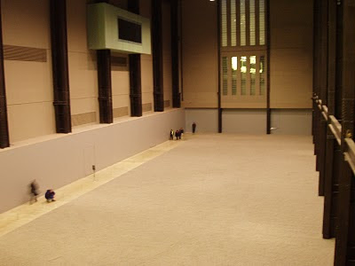

View from the high balcony looking down at Ai Weiwei's Sunflower Seeds.

Walking under the high balcony towards the exhibition.

My favourite taken with a timed shot. The height of the seeds is about six inches.

A slightly out of focus close-up

View from the far end showing the height of the Turbine Hall.


Video recording room where visitors can video record their

responses to the exhibition which are then relayed to Ai Weiwei.

Near the exit. The view down the ramp towards the exhibition.

If you walk under the balcony you reach the exhibition.

This is such a dramatic vista even though it's dark.