Pages

Showing posts with label Landscapes. Show all posts

Monday, 30 March 2020

Snow Scene

A quick gouache of a snow scene to get me through the day.  I left off finishing it completely as the paper wasn't fine enough to capture more detail, but I am happy with the overall sense of place evoked.  Landscape formats are unusual for me as I prefer a square for some reason or another, but this seemed to work.


"Snow Scene"
Gouache on Watercolour Paper - 9" x 6.5"

Tuesday, 7 May 2019

Collage 1 - First Collage Experiment


It's been 21 months since I last posted to this blog for one reason or another.  I am not going to explain too much about the work below except to say it's my first foray into collage.

I adore the engravings of Gustave Dore and combined a few vertical images of the same engraving and just reconfigured the scene, just for fun.


"Gustave Dore - Reconfigured"
Mixed media on MDF Board - Photocopies, Acrylic Paint - 12" x 12"


This is the original engraving I worked from.
The collage has this image multiplied three times.


Wednesday, 10 June 2015

Reflections

This work was taken from a television screenshot believe it or not. The programme featured the Garden of Nympha in Italy and I just couldn't resist the challenge. I painted a similar subject before in May 2010 (is it five years already?) called "Secret Garden" and found it a lot easier than anticipated. This one has far more details but to pull off the real drama, the format would have to be huge and done in acrylics or oils. I just couldn't get the details dark enough with the first layers of colours coming through.


"Reflections in the Lake at Nympha"
Gouache on Cartridge Paper - 14" x10.5" (Approx.)

Thursday, 3 January 2013

Neighbourhood Trees

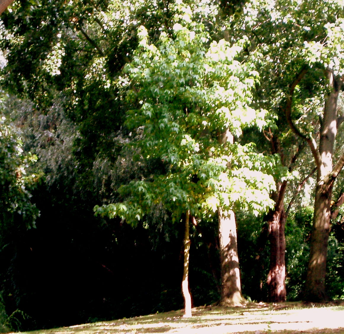
Trees are difficult. The more you see, the more there is to paint and that is where the difficulties arise; for me at least. The format was too small for the subject, but I kept going and found huge frustration in trying to capture the blinding sunlight on the leaves and trunks as well as capturing form and depth of the foliage. Greens still not totally correct, but I learned a huge amount. I started with big washes and worked up to the detail in stages which made it slightly over-worked in the end, but it is acceptable enough to post here.  I know it doesn't have to be a dead-accurate representation of the original photograph, but I did want to portray more than an interpretation. 

"Neighbourhood Trees"
Gouache on Watercolour Paper - 4.75" x 4.25" (Approx.) 

Original Photograph

Sunday, 22 April 2012

Tall Trees

I have been wanting to paint some tall, spindly trees for ages and hadn't realised there were two such gorgeous examples in the beautiful park next door to my home. Sometimes it takes years to take in one's environment! I photographed these recently and decided to paint them today. The work is basically a bit busy and I must learn to edit and work from large areas first and then develop the details at the end of the process. I also had difficulty with the yellows as they were just so transparent and weren't able to pick up the luminous leaves dancing and sparkling in the dark shadows so I mixed in a bit of white.  It's probably worth saying that the sky did have that dramatic transition from dark to light - the values of the blues in the painting are not fabricated. However, I'm fairly satisfied with this one and quite surprised with it really as it was the first time I've worked on this ultra-elongated format.

"Tall Trees"
Gouache on Watercolour Paper - 9" x 5"

Saturday, 11 June 2011

Morning Walk IV

At last, I have finished this series. In one way it was a chore because I am not good at landscape work yet, but with this last one I felt I was working more in the area of painting that I am used to. I need lessons in landscape painting and that is all there is to it, but this work with all the attention being on the surface, was interesting to me and I just love anything with reflections. However, it was a difficult and testing project with a lot of 'micro' brushwork. I wanted to do this in oils so I could emulate the very slow transitions and modulations of colour, but to do that I would need a surface at least 4 feet square and I just don't have the space for that. One day. In truth, the subject also needs a bigger surface to make it recognisable as a reflection in a river bank. Now I am going to have a bit of fun working out what to do next. As I said in last night's post, I have been so wiped out that I can't even remember what I was planning to do. Not a bad thing really as something surprising might come out of it.

"Morning Walk IV"
Gouache on Watercolour Paper - 11" x 11"

Saturday, 14 May 2011

Morning Walk II

I started a second layer on a difficult landscape I'd chosen from my "morning walk" a few weeks back and when that was complete, I had so much paint left over on my palette I found myself saying "I can't throw this away". I'm more careful with my oil paints than with food and I don't know why. So, I decided to use this paint to do an exploratory sketch of my next work in this little series as I am beginning to think I would be far better at these landscapes if I slowed down and really investigated what was required before tackling the main work. I have ended up with a 'sketch' that I am pleased with as it captures exactly what I wanted bar a few minor details which I am not going to take any further. It was so difficult with all the dappled light and intense greens, but for an alla prima painting, a rare occurrence for me, I am happy.

"Morning Walk" - Oil on Gessoed Board - 6" x 6" (Approx.)

Reference Photograph

"Still Some Leftovers"

Monday, 25 April 2011

Morning Walk I

Last week I went on an early morning walk in my local area and took some fabulous pictures hoping to find some scenic gems which could translate into paintings. I did find them a-plenty, but painting a gem is another story. I have said before I would love to paint a superb landscape but I know it's going to take a lot of groundwork, especially painting colours I am not attuned to. This is one of the better shots compositionally where I could at least show some depth and perspective and even though most of the greens were very close to one another in tone and value, I tried to show depth by texture and some minor adjustments to the warmth of the greens.

"Morning Walk" - Oil on Canvas - 8" x 8"

Friday, 22 April 2011

Local Trees

A few days ago I started, and thought I had completed, a small 'landscape' of a local park area next to a bus terminus, but when I got back to it this morning to make a couple of tweaks, I saw that it was far from being anything I could put up on this blog. I had used huge sweeping brushtrokes that couldn't describe the scene at all, so I went in and practically painted the whole thing again and it's much better but far from what I want.

I want to learn how to paint landscapes and local scenes, but find this genre very difficult. The composition of the photograph was undistinguished in itself and ended up being difficult to paint as there were no key landmarks or winding paths to make the picture easier to read. In addition, there was a huge wall of long grass and flowers in the foreground cutting the format in half. Why I started this work I don't know. I thought the red buses would add to it but my painting of them was so bad they looked pathetic so I wiped them out. I'm now going to try and finish a completely different work which has been defying me. Maybe I might post it later on today if I can overcome the obstacles.

"Trees on the Common" Oil on Gessoed Board - 6" x 6"

Thursday, 7 April 2011

Greens, and more Greens.

I am not sure about these two works. I enjoyed doing them, but I struggle so profoundly with greens. The photographic references I used come from a challenge blog, Daily Paintworks, and I am not sure whether or not to send them in. The photographs to work from were deceptively simple, and I knew that as soon as I saw them, but I responded to taking out the oils again after a long time and hoped for something better than I have produced here. I have been painting in gouache for a few months now and I notice that I have lost my "touch" with oils. Another annoying part of this process is that I just could not get the colour of the blue sky photographed accurately - it's much deeper. I think I'll just live with these for another day or so, and then probably make some adjustments here and there before taking the plunge and sending them in.

"German Landscape I"
Oil on Canvas - 8" x 8"

"German Landscape II"
Oil on Canvas - 8" x 8"

Thursday, 20 May 2010

Secret Garden, London.

This is my first submission to the Calypso Moon Artist Movement. Our challenge was to paint our Secret Garden. I live in a very green area of London, alongside beautiful vistas of trees and grassland just a stone’s throw from the Thames River, but, for me, none of it could be classified as ‘secret’. My ‘Secret Gardens’ are the great parks of London, and they are truly ‘Great’. I have my own special corners in these elegant spaces where Londoners come to relax and absorb the beauty and because one can be so anonymous in these masterpieces, a sense of owning a personal spot becomes very real. My secret garden is really ‘secret’ so I am not telling where it is. It is a wonderfully serene corner and I have the feeling that it has been there for a very long time; nothing new, nothing cultivated; just a naturally occurring place of peace. Strangely the vista I have chosen to paint is interesting for its lack of flowers; it’s just a cacophony of greens, layered one on the other with alarming subtlety and complexity.

Depicting the myriad variations of green was something I found tough, but I had set myself the challenge of pulling off this monochromatic scene. Possibly the end result might have been more convincing in oils as I would be able to blend the colours with a bit more subtlety, but I decided to stick with my own personal challenge of learning about 'water colour and gouache' as a medium all over again, and I am finding some marvellous surprises along the way. This work took me six hours.

"Secret Garden, London"
Water Colour & Gouache on Paper - 11.5" x 11.5" (Approx.)

Sunday, 2 May 2010

A Lane in Provence.

After finishing my challenge for the Virtual Paint Out I felt that I had spare creative energy to release and I wanted to paint something special. I just couldn’t find any inspiration anywhere in my large library of photographs or even any items of interest from my home for a quick still life. I eventually landed on a photograph of a lane in Provence, France, and chose to do this water colour. I want to paint two water colour sketches per week, and this week I have only painted one. However, I enjoyed this at the end when it came together, but after two hours work, it looked so boring and similar to the other two I have painted recently. It then hit me; it needs a figure. I have to confess that for me all landscapes have added meaning and pathos with a figure in it. I don’t know why this is, and I could go on about it, but this work looks a lot better with the small figure on the path; just a suggestion of a woman hurrying off somewhere. I made her much smaller than a photograph would have shown a real person to scale, and this was intentional as it always adds to the grandeur of the surroundings. What I like about the effect of adding the figure is that, for me, it seems to take the scene back in time and maybe that is because I put her in a long dress. Who knows?

"A Lane in Provence"
Water Colour on Paper - 10.5" x 10.5" (Approx.)

Friday, 30 April 2010

The Virtual Paintout - April Challenge

This is my first submission to the Virtual Paintout Challenge. Choosing a scene to paint from the Google Map of the Canary Islands was, for me, a major part of this challenge. I chose about ten corners of the Canary Islands I thought would force a good painting out of me, but in the end I stayed with a scene I thought would be easy, but it wasn’t. I cannot say I am happy about this work but I pulled something together in the end. I could have gone in a bit closer to get the painting of the palm trees on the side of the house and made a quirky feature out of that, but I have learned valuable lessons from this one. One interesting thing I found out about the Tenerife flag is that it is identical to the flag of Scotland, only it is a darker, navy blue, so I thought I would just add this in as a little folly. A huge thanks to Bill Guffey for putting this challenge together!

"Calle Tequeste - Puerto de la Cruz - Canary Islands, Spain"
Oil on Gessoed Board - 12" x 12" (Approx.)


Scene painted from Google Maps with permission.


A link to the scene I chose from the Google Maps is here.

Friday, 23 April 2010

Water Colour - Value Sketch

I promised myself I would complete a couple of water colour sketches each week and I have managed to do that (just). I was hoping to do more, but I hurt my neck so for two days I really didn't feel up to it. I chose this landscape from a beautiful photograph of the European Lowlands, probably Holland or Belgium. I would post the photograph here but I don't know who to attribute it to. My basic intention was just to get the effect of the low-lying land with the stretch of sunlight just touching the horizon. The photograph had a serene drama that I have missed somewhat although I am closer to it than I was last night. A day makes all the difference to how one views a painting. I also found the exact rendering of the values very difficult, and I would lay over another dark wash here and there, but it is getting too muddy as it is. I also think there are some superb photographs that don't translate into good paintings, no matter how good the painter is. That is not an excuse for my work here, but to be original and inspired, I think I must get out into nature myself and take my own photographs, or even do some plein air work. so, if all goes well with my artistic plans this weekend, maybe another water colour will appear on this blog tomorrow. I am hoping to start a challenge work, but I have 'sketched' such a complicated response in my mind, that I might have to backtrack a little. That will be in oil, so I am looking forward to seeing how I respond to oil again as it is so much slower than water colour.


"Lowlands Landscape - Sketch"
Water Colour - 11" x 11" (Approx.)

Saturday, 17 April 2010

1,2,3, Testing.

My first foray into watercolours after decades was huge fun. I just didn’t know where to start as I had no references, so I made up a scene. I really wanted to paint some sort of landscape so I had to make it up so who knows what type of tree this is as I certainly don’t recognise it, nor do I recognise the terrain from any of my travels. A pastiche of sorts, I suppose. I can see so many mistakes, especially with the composition. I should have brought the top branches and leaves forward more, but I am not perturbed about them at all and I just love the way watercolour dries immediately. This instant drying of the substance was quite a shock and I had to stop putting so much gouache on the tray - rather reminiscent of acrylics. A change of pace was what I needed and I think if I can keep up with a couple of sketches during the week, I will feel that I am progressing with my art. I am only painting on weekends and it does take some warming up on a Saturday morning to get into the swing of things and feel as though the process is seamless. It isn’t seamless, so I need to do more during the week. This is such a basic work, I hesitate to post it, but I promised myself. Now, I'm on to start, and hopefully finish, a long-outstanding charcoal sketch project that has been languishing in the corner of my mind.

"Imaginary Landscape with Tree"

Watercolour & Gouache on Paper - 11" x 11" (Approx.)

Sunday, 12 July 2009

My Latest Blog Challenge! No. 5.

In the spirit of adventure I have entered another blog challenge. Recently I discovered another super blog Follow the Masters which challenges artists to respond to various images of the Master Painters. This last challenge was to take any Maxfield Parrish work and interpret it. I have visited art galleries in the USA but confess, that I have never lingered in front of any of his work. This therefore was a double challenge because I only had a web image to work from. Interestingly, the images of his work on Google Images vary so dramatically that it is impossible to work out how far they are removed from the original but I would assume, very far indeed, especially the one I chose which is "The Tempest". I loved the web image I chose because it had huge drama and it looked as if it was one of those over-printed images that was many generations away from the original register. I loved the rock formations and I think they were the real hook to get me started on this work because, on close inspection, they reminded me so much of the abstract expressionist work I used to do at University. However, it was great to get it finished, even though it took me far longer than I anticipated, but that is what these blog challenges are all about; learning.


After Maxfield Parrish's "The Tempest"
Oil on Gesso Board - 12" x 12"


Detail that reminded me of my University days!


The Original Maxfield Parrish "Tempest"

Monday, 30 March 2009

Challenge 2. - Beach Family

I just wish I had more time to take this challenge to the level of detail I was looking for. I just didn't 'get there' because I can only paint on weekends at the moment. I loved the scene in the photograph Karin Jurick gave us for this challenge; excellent light, crisp, clear with a magnificent stretch of sea and I felt there was something of a processional and solemn feel to the figures; a stillness even though they were in fact 'doing' something. For some reason or another it felt ancient to me and I wanted to create a feeling of the long-distant past, with a nod to illustrations in children's books, but again, if only I had more time I could have pumped up this allusion. I am also not going to paint on canvas again for something this detailed. The edges bevel downwards and for the photograph I have had to crop of about 2mm on either side which is a nuisance. This whole painting would have been much easier on board - we learn as we go along. So here is my second submission to Karin Jurick's 'Different Strokes From Different Folks' blog.


Beach Family - Hastings, 1066

Oil on Canvas - 10" x 12"