Pages

Saturday 4 December 2010

Twitter Art Exhibition, Moss, Norway

These photographs below appeared on a Flickr Stream yesterday showing how the Twitter Art Exhibition was mounted. This was set up by the artist, David Sandum, to raise funds for a children's library in Moss, Norway. David Sandum asked for 140 artists, all of whom had Twitter pages, to send in their works, postcard size, to be sold for a small amount in the region of $20 and over 250 artists sent in work, myself included. (The "140" represents the amount of characters that are allowed in each "tweet" on a Twitter Page). It was super to see my Asparagus Painting up on the wall at last. It is absolutely super to see this huge effort of David's come to life. Wishing you a great success David! Now, I'm off for a day of painting, after all, it's "Le Weekend"!

Update - 10 January 2011 - My painting "Asparagus for Norway" has been SOLD.
TwitterArt16
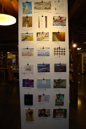
My "Asparagus for Norway" postcard at top left.


Another wall of the Exhibition.
If any of you are interested, the full Flickr folder on the opening night is given below:

Flickr Album of Opening Night of Twitter Art Exhibition in Moss, Norway.

Tuesday 30 November 2010

The Virtual Paintout - November Challenge

I loved the idea of painting Rio de Janeiro and I was hoping to send in three paintings being my usual over-ambitious self, but after flopping on the first one, I decided to take the plunge and do this gorgeous window at Louis Vuitton. I was going to do it in oils but I am so glad I used gouache because it is so much faster and I sent this in at the last minute. I chose a window again, because I just adore painting them. They are often works of art in themselves and the reflections are a major challenge, but massive fun. I've shown the screenshot below my work which gives an idea of what inspired me. And to think I was giving up on challenges. It just goes to show one never knows what will happen.

"Window at Louis Vuitton - Ave. Garcia de Avila, Rio De Janeiro"
Gouache on Watercolour Paper - 11.5" x 11.5" (Approx.)

All scenes painted from Google Streetmaps with permission.

Tuesday 23 November 2010

Twitter Exhibition in Moss, Norway - SOLD

A few weeks ago, one of my Twitter artist friends, David Sandum, decided to stage an exhibition in Moss, Norway, to raise money for a children's library. Via Twitter he invited everyone with a Twitter account to send in a postcard sized painting on paper to be sold off to raise funds for this library. I thought this was a super idea and sent in the painting below. I based it on the photograph I used for one of my favourite asparagus paintings in July earlier this year. (Holy mackerel...was it that long ago?!) I had started out with a painting of a tube of oil paint standing on its 'head' but that didn't work out with gouache for some reason or another, hence the asparagus' emerging again. It is more simplified than the oil painting, but it was fun to paint and include the colours of the beautiful Norwegian flag. I haven't been painting for ages due to time constraints, but now that I have absolutely no deadlines to meet, or paintings to send into a challenge, I am going to paint and draw completely for myself. I look forward to seeing what crops up in my work as I also feel a new creative energy rising. I'll let everyone know if this painting sells. They are going for about $20 so there's hope that someone might want this. I hope so anyway.


"Asparagus for Norway"
Watercolour and Gouache on Watercolour Paper - 6.5" x 5.5" (Approx)

Friday 15 October 2010

Fighting With San Miguel Etc., Etc.

This has been such a weird week. A week where none of my artistic projects had any success and even a planned visit to a major art exhibit tanked. I have five paintings on the go in various stages; three for The Virtual Paintout challenge and two tiny portraits which I am not confident about. All are at the beginning stages, which is where I usually feel like giving up. Nothing seems to happen at this stage, and it takes me a lot of energy to push on. The art exhibit was something I and a colleague were looking forward to - a visit to Tate Modern to see Ai Weiwei's beautiful work in the Turbine Hall. Unfortunately the 100 million pieces of porcelain are giving off dust and that has been deemed a possible health threat so visitors can only view the exhibit from the second floor gallery which, in my opinion, and I think probably that of the artist, takes all the joy and meaning out of the work. Visitors are supposed to walk over these tiny porcelain seeds and muse upon them. What bliss we thought - a superb interlude to a dreary week in the office!! On hearing the news, I threw a mini strop and lost interest, so I came home tonight hoping to move on with my latest Virtual Paintout fiesta. Not.

I decided to do a quick, small oil sketch of a scene I had rejected as I thought playing with the colours would be a good practice run for the three scenes I have chosen. Not. It reminded me of a painting I had done earlier this year of the lane near my home which I keep forgetting to delete from this blog, but keep just to remind myself that I at least tried. Another obstacle was that I was painting on gessoed card and it was so slippery like the Nocturne experience a few days ago. Another obstacle, another lesson.

I am posting this photograph here as a mini diary of sorts, getting stuff out of the system. Maybe at the end of the year I can go back and delete all the junk posts from this blog, but tonight, hey, it's a-staying here.

"Sketch of Street in San Miguel de Allende"
11" x 11" - Oil on Gessoed Card

Saturday 9 October 2010

Value Sketches for Portrait

I have been busy today. After posting the sketch for the Nocturne painting earlier I was determined to move some creative energy. I have two small canvases with a turquoise ground which I want to use for small portraits. I found two beautiful photographs in a glossy monograph on portraits and my works will be based on these. The format of the canvas is tiny - 5" x 5" - and, in prepration, I decided to do some value sketches in exactly the same size. It's been a day of values hasn't it? Many lessons in this session. Firstly, the tiny size cramped any possible rendering of the subtle gradations in the half-tones, and secondly, it was going to be more complicated than I first thought. I thought I would post these sketches here so I can get used to them. I also processed the sketch with a blue tint just to see how the values translate against colour. The light I was drawing in wasn't so good, nor was the photography, but I don't have the correct lighting or camera for drawings. I hope to start on the painting tomorrow.

Preliminary Portrait Sketch
5" x 5" - Pencil on Cartridge Paper

Preliminary Portrait Sketch - Blue Tint
5" x 5" - Pencil on Cartridge Paper

Tuesday 28 September 2010

The Virtual Paintout - September Challenge

This month's location for The Virtual Paintout blog challenge was Manhattan Island. With such massive choice in one of my favourite places on the planet, I decided to develop my theme from last month's challenge when I painted a store front window in Charlotteville, Prince Edward Island, which I had thoroughly enjoyed. I couldn't choose between three windows so I went all out and painted all of them, noticing each one was dominated by a primary colour. I love what happens when the photograph loses its registration through the various stages, and this gives the visual its allure, but also its technical challenges. Another challenge was trying to make them look like real windows and this I did (I think) by including the reflections some of which, if you look very carefully, show the blurred outline of the Google car; I think it was the Google car! What I learned from this challenge was these works should be painted on huge formats, at least 8 foot square, preferably more. Maybe one day when I get my huge studio I can develop this as a theme. (Below each painting is a small reference of the window from Google Street Maps).

"Primary RED at Kenneth Cole, Fifth Avenue, New York"
12" x 12" - Oil on Gessoed Board.


"Primary YELLOW at Bergdorf Goodman, Fifth Avenue, New York"
12" x 12" - Oil on Gessoed Board.


"Primary BLUE at Sephora, Fifth Avenue, New York"
12" x 12" - Oil on Gessoed Board.

Monday 27 September 2010

Three Primaries Out To Dry.

No, that's not a political statement, but it might sum up how I feel about politics and the systems around them at the moment. Back to art, it's much more trustworthy.

I haven't posted here for over three weeks and that is hugely frustrating for me, but I have been working and very hard indeed on my paintings. No matter how mediocre the work that is put up on this blog, I am happy because that means that I am being productive. Productive in practicing rather than in producing work good enough to sell. I'll get there. However, I have been ultra busy painting three works for the Virtual Paintout blog challenge this month and they have to be sent in this Thursday. One is finished, and two are in their last phases, drying, before the next layer can be done. This is the very tiresome stage of the process for me and, ironically, the place where I learn the most. I have based this project not only around scenes in Manhattan, but on the primary colours themselves. They are paintings of huge windows on Fifth Avenue. I will describe how I approached this in my next blog post. For this post, I have taken out the colours and they look completely weird, and it's interesting to see which one works the best for me compositionally. I am having some sort of fun here, so ignore this if you like. I've never put up such a bleak, colourless post, but it's fun to see the Google car in the reflections even in these greyish visuals.


Saturday 4 September 2010

Quick Sketch.

I really needed to scribble this morning. I was hoping to get much more done in the way of sketching but in the middle of all of this, I felt I could only relax if I got through some domestic stuff and left this until I was more relaxed and focused. I have hopes of doing a self portrait for a blog challenge this month, and as I haven't painted or sketched faces for ages, I thought a warm up was essential. This is an understatement. I need major practice runs before I can pull of a reasonable portrait let alone a self portrait. I am putting this up because it makes me feel better. I'm very good at kidding myself this is work. This was done from a photograph.


Pencil on Cartridge Paper

8" x 8" (Approx)

Monday 30 August 2010

The Virtual Paintout - August Challenge

I was rather angry with myself for not submitting a painting to the Virtual Paintout Challenge last month because the delicious location was Hong Kong. Hong Kong has all those incredibly seductive back roads and neon lights, a painter's delight, and I was hoping to find something similar to get to grips with for this month's challenge, but Prince Edward Island in spite of all its pristine beauty, doesn't seem to have a "wrong side of town". Most places do have a more 'interesting' and downtrodden sector of their urban landscape. On my 'tour' of Prince Edward Island I scoured for something a little different from the endless greenery with houses all in a seemingly homogenized vernacular and I eventually settled on a shopfront with complicated reflections and a glowing interior. The screenshot I take from the actual photograph is always a little more diffused than the original scene on Google Maps, obviously, but in one way that adds to the possibilities of painterly fun, but this one was a bit more complicated than I had anticipated so it took longer. I always do that and must stop! Maybe if I painted on a smaller format and was more spontaneous I could save time and send in more than one entry to this best of all blog challenges for artists. Thanks again to Bill Guffey and The Virtual Paintout for this challenge! If you are new to this challenge, I encourage you to go to Bill's blog and see the interview he had with CBC Connect, Canadian Television for a super round-up of this month's challenge. Wonderful and well-deserved publicity and some of the paintings are up as well.

"Shopfront - Queen Street, Charlotteville, PEI, Canada"
Oil on Gessoed Board - 12" x 12"

Scene painted from Google Maps with permission.

Google Map link to this scene.

Screenshot of actual scene.

Saturday 31 July 2010

Fun Departure.

After finishing my asparagus series I just wanted to let rip and free myself up with something a little more exuberant, wild even. I had a photograph of some oil tubes lying resplendent on a sunlit studio desk so I just started painting that with the paint I had left on the palette. It grew and grew and I piled on the paint in ever-increasing layers and ever-increasing brightness. It was huge fun. Even more fun afterwards was playing with the main work by cropping various areas of interest to make instant 'abstracts'. I've shown them below the main work. If you ever were clueless as to how to create a non-representational work, I've just shown you how. (Well one opportunistic method at least). I don't quite know what I am doing to do with it as it will take months to dry, probably even a year, which is a joke really as it is certainly not worth the effort of storing it. Now on to more demanding work even though I am not in the mood.


"Oil Tubes Festival"
Oil on Gessoed Board - 12" x 12"


Saturday 17 July 2010

Asparagus IV.

This is Number IV. I had left this one until the end as I thought it would be the most difficult but it wasn't. I enjoyed painting all those brilliant white highlights of the plastic wrap and these would have been rendered a with a lot more refinement had this work been on board and probably in a bigger format. I left out quite a lot, like the lettering on the bag which would have been fun to paint, and some of the more subtle graduations of colour. I have also put them all together below the photograph just so that I could see how they looked 'together'. That's when I just love the internet. They are together on my mantlepiece and somehow, sadly, in real life, don't 'hang together' as well as they do on this blog. Thinking about that one for a while....!


"Asparagus IV."
Oil on Canvas - 8" x 8"

"Le Series"


Tuesday 13 July 2010

Asparagus III.

Three down, and one more to go with the Asparagus series. I just wish I could paint during the day! I feel as though I am lagging behind; 'behind' what, I really don't know. This piecemeal daubing, a little here, a little there, is getting to me. I am enjoying learning about 'realism' during this series, (and calling it a 'series' is a bit over-the-top) but I still cannot mix the right greens. The actual asparagus, both in real life and in the perfect photograph were a slightly more milky green, which I just could not mix no matter how hard I tried. The fourth work is proving difficult although not quite as demanding as the greens are mostly in shadow. After this lot, I shall need a break, something splashy and expressive. I also think, no, I 'know' that this work would have been better painted on a panel. This canvas was ultra absorbent so there was a lot of overpainting and I found that for the finer details (and there were many) the surface was too grainy to control the brush as the subject demanded.

"Asparagus III"
Oil on Canvas - 8" x 8"

Tuesday 29 June 2010

The Virtual Paintout - June Challenge.

This month's Virtual Paintout challenge was ultra-enjoyable for me - a trip to Hawaii. As usual, I found it difficult to choose a juicy scene to paint from mainly because the whole island is "juicy". In the end, I decided to move away from those swaying palms of the shoreline and find something more urban and dare I say it, mundane? I looked round some of the back alleys for graffiti and found nothing very inspiring or painterly, but with a bit of luck I alighted on a delightful mural outside an art school. Not too difficult to paint, but photographing that glossy black was a bit of a headache. I decided to replicate the linear work of the mural by painting the figure as a 'walking drawing'. Nearly pulled it off. Give yourself a treat and pop over to The Virtual Paintout challenge blog and look at all the marvellous paintings - they're an absolute treat this month!


"Art School Mural" - 12, S. Pauahi Street, Honolulu, Hawaii"
Oil on Gessoed Board - 12" x 12"

Scene painted from Google Maps with permission.

Link to scene is here.

Screen Shot of Actual Scene.

Sunday 27 June 2010

Asparagus II.

It's been ages since I posted anything on the blog, and ages since I painted. All sorts of things took over in my life, but yesterday and today I managed to finish the second of my 'Asparagus Series' if I dare call it that. It's not really 'finished' as there are a few areas that need correcting, but I cannot do any more to it without ruining it, but it's better than the first effort. I actually quite like it.

"Asparagus II"
Oil on Canvas - 8" x 8"

Tuesday 8 June 2010

Asparagus 1.

This was another one of those "I daren't put this on my blog" paintings, but after a while, I decided to post it. I bought some beautiful bunches of asparagus last weekend and thought how magnificent they were as objects and had a wonderful half hour photographing them in all their glory. The photographs were so inspiring and dramatic, I thought painting them would be a pleasure. Not so. I am so out of practice with all my work, especially still lifes, so it is not surprising I struggled. I struggled mainly with colour. The values were very stark and dramatic and my usual fight to find the absolute match with the greens made this work challenging. I also found it almost impossible to match the exact colour of the brown wrapping paper they were placed on and this colour struggle went through four incarnations before I managed to get reasonably close. I have three other photographs of this beauteous vegetable, and I am not giving up on them. I have learned a lot about this and I am going to try some new techniques and processes for the other three. I'm nothing if not persistent!

"Asparagus I"
Oil on Canvas - 8" x 8"

Thursday 20 May 2010

Secret Garden, London.

This is my first submission to the Calypso Moon Artist Movement. Our challenge was to paint our Secret Garden. I live in a very green area of London, alongside beautiful vistas of trees and grassland just a stone’s throw from the Thames River, but, for me, none of it could be classified as ‘secret’. My ‘Secret Gardens’ are the great parks of London, and they are truly ‘Great’. I have my own special corners in these elegant spaces where Londoners come to relax and absorb the beauty and because one can be so anonymous in these masterpieces, a sense of owning a personal spot becomes very real. My secret garden is really ‘secret’ so I am not telling where it is. It is a wonderfully serene corner and I have the feeling that it has been there for a very long time; nothing new, nothing cultivated; just a naturally occurring place of peace. Strangely the vista I have chosen to paint is interesting for its lack of flowers; it’s just a cacophony of greens, layered one on the other with alarming subtlety and complexity.

Depicting the myriad variations of green was something I found tough, but I had set myself the challenge of pulling off this monochromatic scene. Possibly the end result might have been more convincing in oils as I would be able to blend the colours with a bit more subtlety, but I decided to stick with my own personal challenge of learning about 'water colour and gouache' as a medium all over again, and I am finding some marvellous surprises along the way. This work took me six hours.

"Secret Garden, London"
Water Colour & Gouache on Paper - 11.5" x 11.5" (Approx.)

Sunday 2 May 2010

A Lane in Provence.

After finishing my challenge for the Virtual Paint Out I felt that I had spare creative energy to release and I wanted to paint something special. I just couldn’t find any inspiration anywhere in my large library of photographs or even any items of interest from my home for a quick still life. I eventually landed on a photograph of a lane in Provence, France, and chose to do this water colour. I want to paint two water colour sketches per week, and this week I have only painted one. However, I enjoyed this at the end when it came together, but after two hours work, it looked so boring and similar to the other two I have painted recently. It then hit me; it needs a figure. I have to confess that for me all landscapes have added meaning and pathos with a figure in it. I don’t know why this is, and I could go on about it, but this work looks a lot better with the small figure on the path; just a suggestion of a woman hurrying off somewhere. I made her much smaller than a photograph would have shown a real person to scale, and this was intentional as it always adds to the grandeur of the surroundings. What I like about the effect of adding the figure is that, for me, it seems to take the scene back in time and maybe that is because I put her in a long dress. Who knows?

"A Lane in Provence"
Water Colour on Paper - 10.5" x 10.5" (Approx.)

Friday 30 April 2010

The Virtual Paintout - April Challenge

This is my first submission to the Virtual Paintout Challenge. Choosing a scene to paint from the Google Map of the Canary Islands was, for me, a major part of this challenge. I chose about ten corners of the Canary Islands I thought would force a good painting out of me, but in the end I stayed with a scene I thought would be easy, but it wasn’t. I cannot say I am happy about this work but I pulled something together in the end. I could have gone in a bit closer to get the painting of the palm trees on the side of the house and made a quirky feature out of that, but I have learned valuable lessons from this one. One interesting thing I found out about the Tenerife flag is that it is identical to the flag of Scotland, only it is a darker, navy blue, so I thought I would just add this in as a little folly. A huge thanks to Bill Guffey for putting this challenge together!

"Calle Tequeste - Puerto de la Cruz - Canary Islands, Spain"
Oil on Gessoed Board - 12" x 12" (Approx.)


Scene painted from Google Maps with permission.


A link to the scene I chose from the Google Maps is here.

Friday 23 April 2010

Water Colour - Value Sketch

I promised myself I would complete a couple of water colour sketches each week and I have managed to do that (just). I was hoping to do more, but I hurt my neck so for two days I really didn't feel up to it. I chose this landscape from a beautiful photograph of the European Lowlands, probably Holland or Belgium. I would post the photograph here but I don't know who to attribute it to. My basic intention was just to get the effect of the low-lying land with the stretch of sunlight just touching the horizon. The photograph had a serene drama that I have missed somewhat although I am closer to it than I was last night. A day makes all the difference to how one views a painting. I also found the exact rendering of the values very difficult, and I would lay over another dark wash here and there, but it is getting too muddy as it is. I also think there are some superb photographs that don't translate into good paintings, no matter how good the painter is. That is not an excuse for my work here, but to be original and inspired, I think I must get out into nature myself and take my own photographs, or even do some plein air work. so, if all goes well with my artistic plans this weekend, maybe another water colour will appear on this blog tomorrow. I am hoping to start a challenge work, but I have 'sketched' such a complicated response in my mind, that I might have to backtrack a little. That will be in oil, so I am looking forward to seeing how I respond to oil again as it is so much slower than water colour.


"Lowlands Landscape - Sketch"
Water Colour - 11" x 11" (Approx.)

Saturday 17 April 2010

1,2,3, Testing.

My first foray into watercolours after decades was huge fun. I just didn’t know where to start as I had no references, so I made up a scene. I really wanted to paint some sort of landscape so I had to make it up so who knows what type of tree this is as I certainly don’t recognise it, nor do I recognise the terrain from any of my travels. A pastiche of sorts, I suppose. I can see so many mistakes, especially with the composition. I should have brought the top branches and leaves forward more, but I am not perturbed about them at all and I just love the way watercolour dries immediately. This instant drying of the substance was quite a shock and I had to stop putting so much gouache on the tray - rather reminiscent of acrylics. A change of pace was what I needed and I think if I can keep up with a couple of sketches during the week, I will feel that I am progressing with my art. I am only painting on weekends and it does take some warming up on a Saturday morning to get into the swing of things and feel as though the process is seamless. It isn’t seamless, so I need to do more during the week. This is such a basic work, I hesitate to post it, but I promised myself. Now, I'm on to start, and hopefully finish, a long-outstanding charcoal sketch project that has been languishing in the corner of my mind.

"Imaginary Landscape with Tree"

Watercolour & Gouache on Paper - 11" x 11" (Approx.)

Friday 16 April 2010

Shopping & Rambling - But No Art

At work this afternoon all I was able to do was dream of painting and getting back home to the easel. Paintings were running around in my head and I found it hard to concentrate. The solution? I came home via the art materials store. If fiscal responsibility were my forté I would choose another route to come home because the ‘art shop’ is right underneath the station where I end my journey and I find it almost impossible to resist going in for a browse. However, tonight I really did need to buy some water colours, and I hoped to get in a ‘practice run’ with my new purchases once I got home. However, I hadn’t realised how incredibly tired my eyes were, so I decided not to do a thing other than sort out my new purchases like a child. I didn’t buy too much – seven tubes of gouache and some brushes, but these were ridiculously expensive and amounted to £51.00. Ouch!

I’ve decided to add water colour works to my small repertoire and as I have never tried gouache, I am aching to give it a go. I photographed the magnificent objects together with some ancient bottles of inks and pens I have had lying around and hopefully by the end of the weekend, I shall have at least one small work to post here. I shouldn’t tempt fate like that because I have other works on the go, but I think a foray into watercolours will free me up a little – I have hemmed myself in a little lately and I am sure things would be very different if I had a bespoke studio, but until that time comes, I am going to stretch myself in small ways. Now I'm off to rest my eyes in a dark room. Really.

Gorgeous New Tubes of Gouache and Brushes!

Old Pen and Ink Supplies - What could go wrong?

Sunday 11 April 2010

Singing da Blues Now

Who would have thought that I would really love this work after such a half-hearted beginning? I am not going to do any more, even though I would like to work on the shadows and the caps of the tubes, because the paint is getting too thick. Enough! I think I might do more tubes of this ilk, as I really enjoy the challenge of painting a well-worn and dented metallic surface with all the smudges of paint picked up over time. I seem to like painting things standing on their heads and shoulders - lamb chops, tubes of oil paints - what's next?


"Old Holland - Caribbean Blue & Kings Blue Light"
Oil on Canvas - 8" x 8"

Sunday 4 April 2010

WIP - Blues Going Away

I am nearly finished with this work. I started this morning hoping to finish it but some tiny bits hadn't dried fully, so I couldn't put on the glazes I hoped to. What I am trying to achieve is the subtle 'golden' glow that hits the metallic tubes in some areas, and I just can't achieve this with brushwork; glazes are the order of the day. Now off to finish my Baroque Altar. This long weekend is just too short for me. I am too amibitious for my own good, with very little patience to prop me up.

WIP - Old Holland Tubes - Oil on Canvas - 8" x 8"

Friday 2 April 2010

WIP - "The Blues"

Having a gap of 3 weeks away from the paints and brushes is not a good idea. I had no choice really. I was inundated with work and hugely tired and consequently got the 'blues' big time. I knew intellectually that a gap of this sort would throw my painting back a bit, but I wasn't aware of just how much of everything one can lose in such a short space of time. The trick is to always have some work in progress even if it is just an 'exercise' or a practice run. Some time ago, I took a photograph of these two tubes of Old Holland oil colour standing on their heads/caps, and loved it so much I promised myself that I would paint it one day. That day has come and I am not at all impressed with my first rough sketch. And "rough" it is. More tomorrow when I have calmed down and done some self-esteem exercises. If my second phase of this work 'works', I won't leave this one up on my blog. I just felt like tricking myself again by posting and feeling that 'something is happening'. The problem with this work is that I shall go to bed tonight thinking of ways to fix it. Surely I can only improve it?


WIP - Old Holland Tubes - Oil on Canvas - 8" x 8"

Sunday 7 March 2010

Rembrandt Homage I

After spending so much time on my finicky Cup and Lemon Painting which took lots of phases to complete, all I wanted to do was let rip with an expressive charcoal 'something'; quick and easy and fun. Why I ended up processing a realistic homage to a Rembrandt self-portrait doesn't seem to make sense at first, but I started this work, loose and free, attempting to capture the basic form and likeness and then it just became more and more closely aligned with the original in all its aspects. I was working from an A4 size photograph of the painting on to an A2 piece of cartrdige paper. I wanted 'big' so I could free myself up from the rigours of painting on small formats, but I hit a snag, and I learned a lot from this. I was aware from the start that this up-scaling of the original would be challenging but I didn't know how just how demanding an exercise it would be. I couldn't get it exact, and Rembrandt's nose is wrong, but practice and investigation of rendering accurate proportions and measurements will get me there eventually. What I found hugely interesting was just how dramatic and stark Rembrandt's values are in contrast to one another. His darks are really dark and it took hours of standing back and saying to myself "nope - it needs more cross-hatching there" and then standing back again and finding out that even more shading was necessary. I'm leaving it alone now as there is just too much charcoal on the paper to make any adjustments. Another nice part of this experiment was not having brushes and palettes to clean up. Lordy, I'm getting lazy. Now, off to vacuum the charcoal dust of the carpet.

"Rembrandt Portrait - Variation I"
Charcoal & White Pencil on Cartridge Paper - 16.5" x 23.5"


Saturday 6 March 2010

Guess Who? Work in Progress.

I've stopped posting works in progress, because I felt they made my blog look untidy, but I just felt like posting a detail of this charcoal drawing I was working on tonight. It is going fairly well, but after sitting back and looking at it for a few minutes I can see exactly what the mistakes are. So I am back to work on it tomorrow after the fixative dries. Charcoal is magic stuff when you get the hang of it. I had been doing some sketching in the past few weeks and they were all complete trash and that is where they ended up. I am just hoping I can 'hold steady' and keep this one from ending up in the bin. More tomorrow hopefully, and hopefully this one is clickable.


"Portrait in Progress" (Detail)
Charcoal on Cartridge Paper

Monday 1 March 2010

Art Shop - Re-posted. (Clickable Pics).

In trying to make something of this painting I realised that for the first two months of this year, I have been painting 'against myself'. I haven't been 'in the flow' so to speak, and even though that is true from time to time for everyone alive trying to navigate this mundane plane, I really find that when it comes to painting, my expectations for success are probably too high. To be fair to myself, I am only painting on weekends at the moment, and I cannot get anywhere except in fits and starts.

I took the photograph of this local art shop at night just after the rain and liked it so much that I decided to turn it into a painting. Not wise. Capturing that strange yellow light on the pavement and the effects of the flourescent starbursts against the dark was very difficult. I've left it in this 'sketchy' style as I have decided not to take it any further. I have learned all I can from it. I also couldn't get the canvas as taut as I would have liked and I am fed up with canvas as a ground. I like panels, so I am not going to test canvas any more. I think I am also going to give up painting such large areas of darkness as this has proved to be almost impossible to photograph because of the glare.


"Art Shop"
Oil on Canvas - 14" x 16"


The Inspiration.

Saturday 6 February 2010

The Remains of the Day...

Last week, sitting at the office completely bored, I was aching to be at home with my paints and brushes. My drawing and sketching wasn't cutting the ice, so I had pushed that to one side. This morning, I woke up determined to just paint and paint anything that took my fancy. I chose basic still lifes of food; mushrooms, peppers, onions, lemons, mugs and a breadboard. These objects had been languishing in my fridge for over a week and were ready to be thrown out; I am such a bad eater! But at least these precious items didn't go to waste. Or so I tell myself.

I now have three unfinished 8" x 8" canvases drying waiting for the next assault, possibly tomorrow. I was hoping to have at least one finished today but I had decided earlier on in the week to really try and sit back and look critically at my work, no matter how humble the subject. This meant taking breaks and really stepping back and looking at the work at various stages and only going back to it once I had established at least five areas that needed correcting; and then disciplining myself to make those corrections. This works, but it takes a little longer. I took these photos at the end of the day just when the very rare appearance of a Winter sun was slipping down behind the clouds.


Pepper in Progress.

Now You Know Why I Need A Maid.