Pages

Monday, 1 April 2013

Trafalgar Square - Warm Up Sketch

In an effort to get out of the slump I am in I decided not to push myself to hard and just do some sketching. I have tons of photographs of iconic London landmarks and today I honed in on a photograph I hadn't taken much notice of previously. I took this a couple of weeks ago at dusk. It was hellishly windy and the light had just turned a weird grey. I hoped to paint some of these in oils, but thought some warm-up sketches to familiarise myself with the scene and its structure would be beneficial. It was a good exercise just to get the objects in position and work on the values and try to get some semblance of the water of the fountain blowing in the wind. I did this in about 35 minutes and although many details have been left out intentionally, I am pleased that I have accurately rendered the values. The details I would like to have put in could only be shown in a bigger format but I loved working with a dry brush again. I do however prefer the tinted version and I'll have to work out why some time.

"Trafalgar Square"
Gouache on Cartridge Paper - 12" x 10"

The tinted version.

Sunday, 31 March 2013

Loved Mickey!

In the last post I promised to write a brief overview of my visit to see the Roy Lichtenstein retrospective at Tate Modern, but there is just so much to say and I cannot really add anything new to what has been written about this most influential 20th Century artist. I decided to put on a 'keep it simple' hat while going around the vast exhibition - 13 rooms in all - and just respond personally without any questions as to relevance, meaning or historical context. That worked for me as I expected it to and I had a great time.

I loved and adored his early Pop Art which delved into and magnified the comic culture of the late fifties and early sixties, and 'Look Mickey' I think is my all-time favourite. Also in this genre is the work "Drowning Girl" which the Tate had put in the room titled "War and Romance". Yes, that sickly, overt rendering of drowned sorrows, true confessions and death by love and ecstasy were all magnified, even glorified, in large formats but their allure for me is pure nostalgia. In them I see a vibrant America, a happier America, with children and teenagers lost in familiar comic books like "All-American Men of War" and "Girls' Romances" with comforting, comic strip images and their evocative rendering of fantasies-too-far.  A 'fantasy too far' would be the superb work "We Rose Up Slowly". (Immediately below).  I could go on about this work, but it would take too much space.  My 'true confession' is I didn't know such men existed.

"We Rose Up Slowly" 68" x 92"

"Compositions", although not a comic strip work, does link me to remnants of childhood in awful classrooms writing boring compositions and is another favourite; it's massive, starkly black and white, yet strangely comforting at the same time. Nostalgia in me again.  The associative side of art has always interested me and while I admired his later works (shown below) with their triumphal huge formats, they didn't link me up personally with anything except probably "Blue Nude" which inverts, rather coldly, all presuppositions about the revered classical nude as an art form.

By the way, all these visuals below were photographed by me from the souvenir postcard book except the "Compositions" and "We Rose Up Slowly" which were taken at the exhibition by 'mistake'.  Three visitors in front of me were taking photographs with their iPhones, so I gleefully thought "Yay, we're allowed to photograph!" until a security guard came up and told us not to take any more pictures.  Okay, but it was a really good show and I am pleased I went as it cleared up some cobwebs, but not enough for me to open my paints this dull Easter Weekend.  Here in the UK we are being punished with dark skies which, in my estimation, have been the dominant weather feature for the past 15 months.  We're all depressed.  Oh, before I go, did I say how much I hate the new Blogger?  Posting in the old format was so much easier.  Why fix what isn't broken?


"Look Mickey" 1961. National Gallery, Washington


"Drowning Girl" 1963. Museum of Modern Art, New York


"Compositions" 1964.


"Blue Nude" 1995. 205.7 x 152.4 cm. Private Collection


 "Interior with Water Lilies" 320.9 cm x 455.3 cm.
Douglas S. Cramer Foundation

Thursday, 28 February 2013

I Can't Wait!!

I just can't wait to see the Roy Lichtenstein exhibition at the Tate Modern in a few weeks' time. I haven't been to a good 'blockbuster' exhibition for years it seems. I had somehow forgotten the artist as his images have become iconic and overexposed and ,to me, very emblematic of the sixties. Art historical dates aside, my resonance with the artist as part of the sixties is probably very incorrect and I don't want to go into this here, but looking through some images tonight I was taken back in time to the source of these paintings; those kitch, corny love book comic strips coming out of the United States that I wasn't allowed to read or buy as a kid. Oh no! These were not allowed in my home, but I do remember having access to some of them and memories of those times flooded back. Strangely enough, I could always draw these faces (and I drew many as doodles on the side of school notebooks) with waterfall tears falling out of heavy-lashed eyes, but trying tonight with a piece of charcoal (wrong tool - I should have used a simple pencil) I realised that I couldn't draw like this any more. The point I am making is that I should have been able to pull this off and it showed me just how much fluidity I have lost over the years and how badly I need to get back to drawing. My silly effort is posted below the 'real' Lichtenstein works - tinted, in the spirit of 'pop'.  It's not even good enough to be a legitimate 'homage'.  I shall report back in a few weeks a mini review of my experience at this exhibition.

Roy Lichtenstein
Roy Lichtenstein - I presume
Roy Lichtenstein - "Wham!"
My Doodle

Thursday, 3 January 2013

Neighbourhood Trees

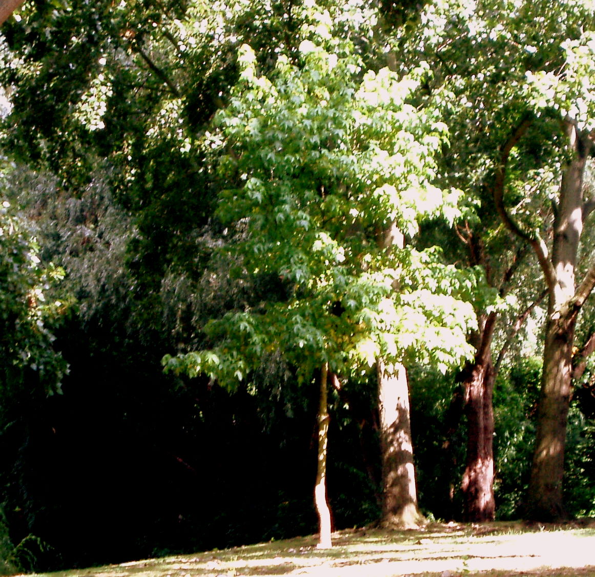
Trees are difficult. The more you see, the more there is to paint and that is where the difficulties arise; for me at least. The format was too small for the subject, but I kept going and found huge frustration in trying to capture the blinding sunlight on the leaves and trunks as well as capturing form and depth of the foliage. Greens still not totally correct, but I learned a huge amount. I started with big washes and worked up to the detail in stages which made it slightly over-worked in the end, but it is acceptable enough to post here.  I know it doesn't have to be a dead-accurate representation of the original photograph, but I did want to portray more than an interpretation. 

"Neighbourhood Trees"
Gouache on Watercolour Paper - 4.75" x 4.25" (Approx.) 

Original Photograph

Tuesday, 1 January 2013

Homage to Henri Fantin-Latour

I decided to celebrate the first day of 2013 with a gouache to hopefully set the tone for doing more paintings during the year ahead. I chose a detail from a wonderful painting by Henri Fantin-Latour (shown below) because I needed something to copy. At present I am not in the mood for doing anything original or challenging. This was challenging enough as the paper is too rough, but I am satisfied with it, so that's saying something!

Happy New Year to all who stop by my blog.

"Homage to Henri Fantin-Latour"
Gouache on Watercolour Paper - 10" x 9" (Approx.) 

Original Painting by Henri Fantin-Latour

Sunday, 7 October 2012

Old work revisted

Two years ago I started a work in oil for The Virtual Paintout challenge and didn't finish it because I just couldn't get the colours right. I then tried to do it in gouache and watercolour and it still didn't work out but I found this half-done work a few weeks ago and was determined to 'fix' it. I didn't!! However, I then became determined to 'finish' it to some level of competence. I couldn't match the glowing oranges and rusts of the original photograph as those colours just didn't exist in my collection of gouache tubes and the detail was too fine in the original photograph to transpose to this small format, especially in that long line of small houses on the left. I also should have used a finer grain of watercolour paper to make detail work easier. The only thing I am really happy with is the tree, and even that needs some fine-tuning but I can't do any more without muddying the whole work. I now have lots of work on the go for a year-end project which might be a bit too ambitious for me taking into account the little spare time I have for painting on the weekends. We carry on.


"Lane in San Miguel de Allende"
Gouache, Watercolour and Coloured Pencil on Watercolour Paper 6" x 6"

Sunday, 30 September 2012

The Virtual Paintout - September 2012

Yet again I have indulged my love for painting shop windows with muted objects behind the vast sheets of glass and their weird reflections. I make no excuse for this but I do add to the technical difficulty with this obsessive response to the Virtual Paintout every time I do it, but I suppose it wouldn't be a challenge for me otherwise. I had hoped to do two, but just ran out of time. Below my work is a screen capture of the Google Streetview I used as my reference. I cropped the top left hand corner of the shopfront and used that for the composition.


"Storefront Window - Kobmargergade Street - Copenhagen
Oil on Board - 12" x 12"

Google Street View - With kind permission from Google

Saturday, 15 September 2012

Gesture Drawing - Best of the Bad

I am determined to start drawing again, drawing each day and drawing skillfully. I recently found a website that puts up photographs of life models in various poses for artists to use and practice their drawings. Great idea and a fantastic service but heck, did it test me tonight. I drew better at school, truly. This close up of one of the drawings was the best of a bad bunch. Also, the photography isn't that hot.


"Head in Hand" - Close Up
Pencil on Cartridge Paper.

Tuesday, 7 August 2012

City Squared 1.

I am hoping to paint some cityscapes shortly but I want to do quite a few sketches of favourite scenes before I start painting. I am finding that sketching the scene before I paint is a very good exercise for me even though it drives me mad as I am so impatient. All I wanted to do here was investigate the values, perspective and composition, and also to see whether the charcoal I have can 'handle' small works. Well it can't really and I couldn't get in the finer details so I stopped trying. I am going to buy a professional brand in a few weeks' time, the kind one sharpens with sandpaper.  That should be fun.  I had hoped to put in more of the details of the cathedral but that just proved impossible.

"St Paul's Cathedral"
 8" x 8.5" (Approx.) Charcoal on Cartridge Paper

Tuesday, 31 July 2012

I'm back & who cares etc.?

My last post was a lament for my lost or stolen camera.  I never saw it again and I now have another which I claimed on insurance.  It wasn't a good deal, and I won't go into that as it makes me so angry to think what happens to the consumer here in the UK with insurance and financial services' rip-offs, but the camera is the same brand as my old one and has a few extra features plus a wider zoom.  What surprised me was how lost I was without one and I seriously didn't even feel like doing much art because of this which is a weird syndrome I shall have to work on at a later stage.  Why couldn't I just paint and get on with it?  My work doesn't need to be photographed - who the heck is waiting for it?  What am I doing here not feeling my work can progress without being documented?  Anyway, I feel as though my tools of trade are now complete and I look across at the disturbingly bad work in progress in the corner, a watercolour of a church altar, and I also lament the lack of practice I have been getting in lately.  No-one's fault but my own.  Some work will appear in the next few weeks; it will, it will, it will, it will.....will it?

"Watercolour collecting dust - early evening in the Studio"